Blog
A CHECKLIST FOR DESIGNING YOUR KITCHEN
There is a lot that goes into the design of a kitchen and many details you need to consider, missing just 1 or 2 things can be devastating to your outcome and a daily frustration as you use your kitchen.
I’ve designed a few kitchens in my time, including my own, and refined my checklist of what needs to go into a kitchen. I’ve adapted it for you to use, so here goes, an extensive checklist for designing your dream kitchen.
Needs and wants
- Get clear on your needs and wants. Whats important to you in your kitchen? Maybe it’s functionality, or cooking large meals or entertaining?
- List out your dealbreakers. For me, it was an island bench! I love having my family sit at the island bench and chat to me when i’m in the kitchen.
Set a budget
- Depending on your chosen finishes, level of DIY and the size of your kitchen they can cost anywhere between $10-35k (conservatively!)
- Work out what you’re willing to spend and let that inform your decisions. The pain of trying to cut costs when you’re already into the project is one you’ll want to avoid!
Measure your space
- Whether you’re renovating the kitchen in its existing location or moving to a new one, measure it. Don’t be the person that orders an expensive kitchen only to find it doesn't fit.
Create a design concept
- Whats the look and feel you want? Find images that show the style and finish you want.
- Consider what you already have in your home that your kitchen will need to work with.
Design the layout
- Take your time with this step, poor choice in finishes can always be fixed but you’re stuck with a bad layout.
- Determine the layout style: galley, L-shapes, U-shapes or open. Often the space you have will have an impact on the style of kitchen you’ll need to design.
- Ensure you are creating a logical and efficient workflow between the cooking, prep, cleaning and storage spaces.
Choose your appliances
- Once you’ve selected your appliances, check their sizes and make sure you’ve allowed adequate space and a good location for them in your layout.
Consider your storage
- Don’t underestimate the amount of storage you’ll need.
- Also, consider where you want to store items? For example, you might want your plates close to the bench area where you plan to plate up.
- Plan to include different types of storage as well: drawers, shelves and pantry space.
Select your finishes
- When it comes time to select your finishes refer back to your design concept and let that guide your selections.
- It’s also worth considering the longevity of your selections and how they will age with the amount of time you intend to keep the kitchen. Will these selection still look good in 5 or 10 years time?
Lighting
- The kitchen is very much a work space so it needs to have ample task lighting.
- Consider how you can incorporate LED strip lighting, or overhead lighting to ensure the space feels well-lit at night.
Fixtures and Hardware
- This include selecting a sink, tap, handles and any specific fixtures in the design of your kitchen.
- Take time to think through your sink and tap selection, do you want a sink with an apron or a tap with an extendable hose for cleaning? Many sinks and taps look gorgeous but aren't practical for high-use kitchens- this includes under-mount sinks!
Electrical Outlets
- Last but certainly not least! You can never have too many power-points, well maybe you can- but you get my point!
- Consider where you will use appliances, charge phones, or display items such as google hubs -these all need power points.
- Not enough power points will quickly become a pain point in your kitchen, but the right amount in the right places will have you cooking with ease!
Every kitchen design is unique, so adapt this checklist to suit your specific needs and preferences. Taking the time to think through everything you need in your kitchen before you kick-start your renovation is worth the investment to avoid costly mistakes!
.
Blog
five mistakes i’ve made as an interior designer
I might be a qualified interior designer but believe it or not, I’ve made design decisions that I now realise weren’t great.
Here are 5 mistakes I’ve made and why I won’t be doing them again.
Insisting wall and ceiling whites need to be different
I always thought it was important to differentiate between the wall and ceiling surfaces, even if both are white, but I’ve come to realise that’s not necessary.
showing distinction between the two surfaces is important but it’s not a difference in the white paint colour that will do it, it happens naturally as the walls are on different planes.
You can paint the walls and ceiling in the same white but the impact of natural light on the room will always make them look slightly different anyway as they’re on different planes. Cool huh?
Put the sink in the island bench
I know, this is a big one and maybe a little controversial. If I’m being honest this is a new one for me and something I’m just starting to realise isn’t always a great design decision.
The kitchen island is a central point within the home and serves many purposes, the least of which is a place for stacking dirty dishes and washing up. The more I’ve thought about it I’ve realised washing up probably shouldn’t be done in the middle of the kitchen, at a minimum it should happen off to the side or in the butlers pantry.
Without a sink in the middle of it, a kitchen island can be a large prep area (most kitchens need more large food prep area), an informal meal eating area, a work bench, homework spot or serving bench when entertaining, just to name a few! Putting a sink in the middle of the island not only limits the functionality of it but puts everything on the island bench at risk of getting wet.
Used hinged cupboards instead of drawers
I now use drawers wherever I can instead of under bench hinged cupboards. It costs a little more to use drawers but they’re worth every cent!
Cupboards are hard to keep organised (think of your kitchen, bathroom or laundry), difficult to access at the back and uncomfortable when trying to reach into as they require you to bend down to see into them.
If hinged panels are the aesthetic look you’re after you can even install drawers behind them to keep functionality a priority.
Used real timber veneer
I might get piled on by the design industry for this one but I no longer think timber veneer is a suitable finish for family homes.
Is it suitable for high end residential houses? Maybe, Can it be used in corporate offices? Sure. But in family homes? I don’t think so.
Depending on its finish timber veneer can be vulnerable to knocks and discolours unevenly over time.
Many veneer suppliers have real wood laminate alternatives that are a bit better but still not as hard wearing and reliable as melamine.
Ignored human behaviour
It’s easy to get fixated on how the client would like to live in their home and realistically how human behaviour will creep in once life gets going.
The easiest example of this is when I failed to include a ‘dump zone’ in the entry area of a home which meant the kitchen bench became that dump zone. Clients may want a tidy home with everything in its place but designing to include typical human behaviour is a more realistic way of getting them to that goal.
These are just a few of the lessons I’ve learned over time and certainly not absolute rules. Being an eternal student means I’m constantly learning as our lifestyles evolve so stay tuned for part 2 in a few years time!
.
Blog
Common Design mistakes in open plan living
Open plan living is the mark of todays homes, new builds all have it and renovations are all including it.
Open plan living not only creates a sense of spaciousness, it also promotes interaction within the daily lives of families. But despite its many advantages, the design of open plan living can be tricky to get right and too often its hastily implemented by just ‘removing all the walls’ and families find themselves frustrated with their very open living area.
Here are 4 common design mistakes people make when designing open plan living areas and how you can avoid them.
A lack of defined zones
If you don’t establish distinct zones for different activities your open plan living area will feel like a furniture showroom. Without clear boundaries, it can become challenging to define the purpose of each area, leading to confusion and a cluttered interior just full of furniture.
Be sure to include things such as rugs, purposeful furniture arrangements, or even subtle changes in flooring or decorative lighting to define zones for cooking, dining, and lounging.
Ignoring flow and traffic patterns
The way we move through our homes each day is one of the most important things we can observe before making design decisions. Placing furniture in the main paths of travel can lead to frustration and congestion as your family move through the house.
Reflect on the traffic patterns (yep, i’m talking about the rush out the door of a morning!) of your family before you implement your open plan space. Plan to include these paths and ensure that furniture arrangements don't obstruct the natural flow of movement.
Overlooking privacy needs
Some open plan spaces can compromise privacy as they remove any physical definition from the space and leave people feeling vulnerable or uncomfortable.
If possible, try and avoid your open plan space being a big square or rectangle. Rooms that have pockets or stepped walls allow for privacy between the different zones within an open plan space. It’s equally important to consider the privacy of people entering and exiting rooms like bathrooms and bedrooms. For example, it’s uncomfortable for people to exit the powder room if its entry door is visible from the kitchen or dining space. Nibs and hallways, for example, can help provide privacy to these types of spaces.
Not considering future adaptability
Failing to plan for future changes can lead to frustration with your open plan layout over time, you’ll either find yourself re-building walls you knocked down or compromising your use of the open space that now needs a little more definition.
Before making changes think about how you’ll use your home for the next 1, 2, 5, and 10 years. The spaces that serve your toddler (e.g. completely open) wont serve your primary aged child who needs somewhere to sit and focus when doing homework.
I’m a big advocate of open plan living spaces as i think they serve our version of family life today, however, its easy to go too far and find yourself frustrated with open plan living. By thinking through the change before implementing it you can avoid these common mistakes.
.
Blog
What to do when you’ve made costly design mistakes
You’re renovating your home, or building a new one, and everything is going well, exciting even, until… you visit site and realise you’ve made a mistake.
A costly one.
Maybe it’s the wall tile in the bathrooms, or the wall colour throughout the house or even the layout in a certain area. You can feel your anxiety rise as you realise correcting the mistake is going to be expensive, time consuming and you cant stop thinking that if you’d just gotten it right the first time this wouldn’t be happening. That internal monologue can be savage.
If thats you, hear me when i say: it happens.
Honestly.
Getting design decisions wrong can happen to anyone, even professionals (hence why we have insurance!), so, it’s time to stop focusing on what you got wrong and start focusing on what to do next.
Heres my advice:
Take a deep breath, it’s easy to become overwhelmed
This might seem silly, but honestly, take a moment and a deep breath in.
Designing your home is a high stakes game, it’s expensive and stressful so it’s easy to start feeling overwhelmed when you realise somethings gone wrong. Nothing good comes from making decisions when you’re stressed and panicking, seriously, high levels of cortisol disable good decision making, so take a deep breath before you move on.
Get clear on exactly whats wrong
Its easy to throw the baby out with the bathwater, so try and get clear on exactly whats gone wrong. Look at the room or area objectively, is it the whole room thats wrong or just the wall colour? Is the whole bathroom a mistake or just the grout colour?
It can be a good idea to bring someone in for an opinion at this point but make sure it’s not a well meaning friend or family member who will just tell you it looks good because they want to help you feel better. You need helpful objective opinions that will help you fix the problem, someone removed from the outcome.
This may be the moment you consider hiring an interior designer. Now hear me when I say this is not a shameless plug! I’ve worked with many clients who have engaged me at this point when they realise they need an external professional opinion so they can move forward with confidence in their selections.
Work out the minimum amount of work to salvage the room
Let’s not throw away money here, if you’ve picked a tile and after seeing it installed are now realising you don’t like it, replacing the tile may not be a financial option. So, what can you change to salvage the room and increase your likability of the tile? Great creative! Can you change the grout colour? Can you change the paint colour of the surrounding walls? Can you change the finish on the tapware you were planning to install? (brushed copper instead of chrome?). Think outside the box, what’s the easiest and cheapest fix for the problem to get it to a point that you will be happy with.
Making mistakes is part of the design journey, so don’t let the stress of it all overwhelm you.
Every mistake is fix-able, you may just have to get a little creative!
.
Blog
Invest in your home: Maximising resale value
Whether you purchased your home recently or many years ago, a home is an investment for more than your family and sense of stability, its a financial investment, and one that you’re going to want to look after, improve and one day sell again hopefully for a profit. Before making changes or additions to your home it’s important to view those changes through the lens of investment, even if you're making the changes for your family, as they will still impact the resale value of your home when you choose to sell it again one day.
I’ve put together a list of areas you should be investing in and some to avoid! Let’s get started!
Do Invest in:
Curb Appeal
You can’t wrong investing in the outward appearance of your home, that first impression is easily a lasting one. Specific curb-side areas you may want to focus on improving are: the house finish (new cladding, cleaned brickwork or fresh paint), the gardens (remove weeds and add low maintenance plants), the driveway (clean it, re-finish it or seal it) and the lawn (level it, kill out the weeds and fertilise it).
Kitchens and Bathrooms
You’ve probably heard the saying “kitchens and bathrooms sell houses”- well, they do. Investing in the upgrade of your kitchen and bathroom is something your family will enjoy daily and, assuming those spaces are still fresh and current, something that will draw buyers in who are looking for a convenient purchase they can move in to immediately.
Creating Open Plan Living Spaces
Contemporary homes now have the kitchen, dining and lounge spaces all within one open area. Removing walls to create a sense of openness will make your home feel bigger, more modern and encourage more connection within your family.
Energy Efficiency
Improve the energy efficiency of your home wherever you can, things such as solar panels to offset your power bill, energy efficient windows that don’t lose as much heating and cooling and insulation in walls and under floors. This will have a direct impact on the value of your home and running costs.
Storage
The more storage the better! So many rooms within your home need storage and many houses are lacking what families need, consider how you can convert under-utilised spaces such as under stairs and garages to add more everyday and long term storage.
Outdoor Living Spaces
This one is critical (for those of us who live in Australia) as so much of our family living and entertaining is done outdoors. Invest in your outdoor space, if you have one, to ensure you have places to dine, relax and green space for kids to play. This doesn't have to be a lot, just neat and practical.
Neutral Colour Palette
I’ve left this point until last as it’s a tricky one. A neutral colour palette is essential if putting your home on the market but not if you’re just planning to live in it for the foreseeable future. A fresh coat of paint is always a good investment but if you’re wanting to paint the lounge room in your favourite shade of purple it’s just important to know that you may need to re-paint before selling if you’re wanting maximum prospective buyer attention.
Don’t invest in:
Over-personalisation
I’m not talking about family photos and things that make a house a home, i’m talking about large permanent changes that are done to suit your preference over whats a good investment in your asset that will yield a return for you one day. For example, when looking for our first property my husband and I went to the open home of a beautiful, freshly renovated family home with a large yard only to realise they had removed the 3rd bedroom to make it into a 2nd lounge space. It was a lovely lounge area but they had just turned their 3 bedroom home into a 2 bedroom home for no good reason! Needless to say, it sat on the market for a very long time.
DIY that should do done by professionals
I get it, renovations can be expensive, but there are some things that should be left to the professionals. If you’re not experienced or confident in carrying out a DIY project, hire a professional, as poorly executed work can lower the value of your home.
Excessive Renovations
Just because you can, doesn't mean you should. The renovation process should always start out of a need and be the answer to a problem within your home. Renovation for renovations sake does more harm than good as you invest money beyond the value of the property. Keep your home upgrades in line with the overall valuation of the property and neighbourhood.
Your property is always your home first and foremost, but following these steps will ensure that you are making changes and improvements that are an investment in the property and will continue to see its value rise for the day you choose to sell it.
Blog
Are you feeling overwhelmed by all your design options?
Do you find yourself staring, paralysed by the sheer number of design choices in front of you? Whether you're working on selecting paint colours, sketching out bathroom layouts or picking new furniture the abundance of options can be overwhelming. Here are four practical suggestions that you might need to help you navigate the sea of choices and make confident design decisions.
Remind yourself of why you started
Take a step back and clarify the purpose of your project. As you venture out into the sea of options its easy to become consumed by the endless opportunities they present and lose track of why you started- trust me, this happens to designers as well.
In that situation, ask yourself a few quick questions; why are we making this design change? what are our functional requirements? And, whats going to work with the current style of out home? Theres no point choosing a cute two seater lounge when you’re a family of five, or selecting brushed copper tapware when you have chrome everywhere else in your home.
Break it down
Sometimes the sheer size of a task and all the selections involved can bring on the overwhelm, so break it down and list out all of the decisions you need to make. Choosing a stone benchtop feels much more achievable than designing a new kitchen, its also very satisfying to tick things off as you complete them. If you’re feeling really ambitious, set some due dates against those tasks to really speed the process up!
Use a Mood Board
Whether you’re shopping in store or online, having a mood board is critical. I start all my design projects with a mood board and describe it to clients as ‘the overarching direction of the design’. It sets the intention for the look and feel that you want to achieve and acts as a reference for all design decisions to come. So, when you’re looking at that gorgeous pastel artwork, refer to your mood board and let it guide you one whether thats the right purchase or not for your home.
Take a break
This might seem counter-intuitive but taking a break can be one of the most helpful and productive things you can do along the creative journey. It not only allows your brain to rest but in doing so gives your brain a chance to sift through he endless options you’ve been looking at and marinate on them. I guarantee you, returning to your project after a break will have you thinking clearer and more decisive!
Remember, the design process is meant to be an enjoyable creative journey, not a stressful one. When it’s all starting to feel like too much reminding yourself of why you started, breaking down what you need to do, using a mood board or taking a break can help you navigate the world of design choices with confidence and ease.
Embrace the possibilities, trust your judgment, and enjoy the process of bringing your creative vision to life!
Blog
Whats the difference between a designer and a decorator?
While the terms "designer" and "decorator" are often used interchangeably, there is a difference between the two.
A designer is a professional who is trained in the principles of design and has a formal qualification in the field.
Designers work to create functional and aesthetically pleasing spaces that meet the needs of their clients. They consider factors such as the layout of the space, the flow of traffic, the use of color and texture, and the selection of furnishings.
Designers may also work on larger projects such as the interior design of entire buildings or outdoor spaces.
A decorator, on the other hand, is someone who specializes in the selection of furnishings, fabrics, and accessories to enhance the look and feel of an existing space.
Decorators often work with clients who already have a functional space but want to update or refresh the look of it. They may focus on selecting furniture, artwork, window treatments, and other decorative elements that complement the existing space.
While there is some overlap between the roles of a designer and a decorator, designers tend to have a broader range of skills, including an understanding of architecture and construction, while decorators focus more on furnishings, styling and the overall aesthetics of a space.
Blog
4 things you might not know about working with a designer
Are you considering hiring an interior designer to work on your home? Maybe you’ve worked with one before or maybe this will be your first time and you’re approaching it with caution. Either way, here are 4 things you might not know (but will find helpful to) about working with an interior designer.
The goal is solutions based, not just what looks pretty
I wish more people knew this about interior designers, that were not just in the business of making something look good, it also needs to function and serve your family in a way that improves your quality of life, otherwise what’s the point? If you have a beautiful kitchen (magazine worthy!) but it’s a nightmare to make a meal in that’s not serving you and in the long run you’ll only come to resent it. It’s probably the biggest hesitation I hear from people when they’re considering working with designers “that they’ll just create something for a magazine, not that we can live in”- so not true. We’re in the business of solutions based design that meets your needs and looks great too.
Collaboration Is Key
Working with an interior designer is not a one-sided affair. It's all about collaboration! Sure, we’ll do the legwork but it’s like the saying “you only get out as good as you put in” if you take the time to brief your designer and give them quality information up front, you’ll get a much better outcome. Designers are not just there to impose their own ideas; they're eager to listen to your thoughts, preferences, and dreams for your home. They want to understand your lifestyle, tastes, and the functionality you desire. By working together, especially in the initial briefing stages, you'll ensure you end up with a space that reflects your personality and meets your unique needs.
We can offer budget-friendly solutions
You might think that hiring an interior designer will blow your budget sky-high. Nope! One of the most valuable skills a designer possesses is the ability to work within your financial limitations. We know how to source affordable alternatives, negotiate prices, and find creative solutions without compromising on style or quality. With our network of suppliers and industry knowledge, we can help you achieve your desired result within your desired budget. So, don't let financial worries hold you back from seeking out a designer!
We won’t show you endless options
Creating a design is creating something bespoke, something unique, that’s been designed specifically and thoughtfully in response to your brief and needs. Whilst designers don’t work in options they do work with revisions, which means once a design is presented it can then be revised and modified once feedback is given from the client. A few revisions are usually included in the price of your design to allow you the chance to make changes to what’s been presented.
Working with an interior designer is a journey but one that will see you collaborating with a professional who is focused on solutions, values your input, respects your budget, and will create a bespoke solution just for you.
Blog
A beginners guide to space planning your home
Are you moving into a new home or planning a renovation on your current one? If so, it's essential to think about how you'll use the space you have and plan accordingly. Space Planning at the beginning of your design journey is about taking the time to ensure you make the most of the available space you have and be certain it meets the needs of your family.
In this post I share the process you’ll need to follow (and that I follow) to ensure you maximise the potential of your home. From identifying your needs and priorities to optimising room flow and functionality, these simple steps will see you on your way to space planning like a pro.
Map your Movements
Think about how you use each room in your home, how do you and your family move through the house each day? Your families lifestyle will dictate how you use each space and highlight functional changes you may want to make.
For example, the kids use your ensuite because the main bathroom is further from their room than yours. Or you entertain regularly but find yourself disrupted from conversations running between the lounge room and kitchen because the space isn’t open plan. Or, you've organically developed a dump spot by the kitchen bench for school bags, coats and shoes because there’s no storage or mud room/laundry by the main entry point of the house. These are all regular movements that aren't necessarily working well for you can be addressed in your space planning.
But it’s not all about whats negative, make sure you take note of things that work well too so you can ensure you keep those things or add more of them. For example, wall to wall wardrobes in all bedrooms and a large lounge space for family time in the evening.
Evaluate your findings
Once you’ve mapped your movements, evaluate your findings and condense them into dot point form, this is will serve as your brief when looking at your layout (and what designers spend a-lot of time trying to get out of their clients!). Take your time with this step, getting a good and thorough brief is the foundation of goos space planning.
Measure your Space
Now we get practical. Take measurements of each room, including length, width and height and draw the layout of the room, space or house you are space planning. Make sure you measure doorways, windows and any other obstruction that will impact the layout.
Create a Floor Plan
Using graph paper or a digital tool, sketch out the dimensions you have taken and begin your space planning! Work through each room or area that you want to address referring to your brief as you go. Experiment with different layout options and furniture arrangements until you find a layout that maximises your space and flows well.
When space planning your layout consider how people will move through each room, you don't want to create awkward pathways or block important areas such as doorways or windows. Make sure there's enough room for people to move around comfortably and that furniture placement doesn't impede traffic flow.
Evaluate your Floor Plan
Once you have a layout that you think meets the requirements of your brief, evaluate it against your brief. You’ll know you’re done if you’ve met the brief and layout feels good to you.
Making changes to your home can be daunting and overwhelming but by starting with a good foundational brief and taking the time to space plan your changes you can put those concerns at ease. Don’t feel you need to rush this process, take the time to get these initial steps right first and it’ll ensure you are creating a functional and comfortable home that works for your lifestyle.
Blog
What is a mood board and why do you need one?
If you’ve ever worked with a creative person, you may have heard them mention mood boards. Mood boards are often the first step in the design process, especially if you’re working with a graphic designer or residential designer.
But what are they? Lets be honest, they sound a little weird. A board… about your mood?
Yes, that’s exactly that they are!
But not about your mood exactly, the mood you’re trying to create in your home or interior. Lets do a quick-fire round of questions on mood boards.
Ready?
What is a mood board?
A mood board is a group of imagery and words that convey the design intent, palette and mood you want to create in an interior you are about to start working on
Why do I need a mood board?
A mood board not only sets the intention for the design to come, but it also ensures you and your designer are on the same page. When you say ‘I like coastal style interiors’ I may interpret that differently to how you are see it. A mood board uses imagery to ensure we are on the same page.
It also keeps design cohesion. When making selections for your interior, your designer will keep referring back to the mood board you approved to ensure it works with the design intent set out on the board. Likewise, If you are making purchases for your home, you can use your mood board to provide you a little more confidence in-store that your new pieces will work with the design of your home.
How do I create one?
The obvious answer here is to make a collection of images you like, but the key to this answer is only choosing images you are drawn to. If you feel a pull to an image, then add it to your collection. This can include images of interiors but also nature, texture and shadows. Anything that adds to the mood and style you are trying to create.
Then, lay the images out and arrange them together. Make some images bigger and some smaller depending on how important they are to you.
Finally, add some words to describe the images you’ve chosen and scatter those among the images. Then, you have your mood board.
I create mood boards for every client I work with, especially if we’re working together virtually. They are my version of insurance as they make sure understanding my client and that we’re both on the same page.
Blog
Four signs that indicate its time to renovate
Thinking about renovating?
Aren’t we all?
With shows like The Block and House Rules on most nights a week renovation is easily on all our minds, but knowing the right time for you is important, so here are some things to look out for, so you’ll know when it’s time.
Things about your home frustrate you.
When we purchased our home, the kitchen was in a small room at the back of the house. We hadn’t lived here long before I knew it had to change. I couldn’t see my daughter from the kitchen when we were home alone together and the constant running in and out quickly frustrated me!
If things in your home frustrate you, like the layout, the kitchen that’s falling apart or even the lack of bathrooms, it may be time to renovate.
You no longer identify with your interior
When I was growing up, my mum painted a blue suede feature wall in our lounge room. I remember when she did it we thought it was beautiful and admired it for years. But fast forwards a decade and it felt out of date, the suede felt daggy, and the colour felt wrong.
The nature of design trends means they’ll come and go, if you have elements in your home that once felt cutting edge but now just don’t feel like you, it may be time to renovate.
You want a change, but you don’t want to move
This is a classic reason for renovating, you’re living in the perfect location but not the perfect interior! If that’s the case for you, you guessed it, it may be time to renovate!
You have the finances
Good design is an investment, both working with a designer and implementing the design. Its important that you do your research first on what your renovation might cost you and what you realistically have to spend. Going through the design process only to realise you can’t afford to implement it isn’t an enjoying process for anyone.
If you’re ready to renovate and would like the help of a professional, contact me today for a no obligation phone consult and free quote.
Happy Renovating!
Blog
Everything you need to know about picking the right white paint
You’ve decided to paint, and thinking you’ve opted for a simple, even conservative, choice you arrive at the paint shop to buy your tub of white only to be greeted by what looks like millions of different shades for you to select from.
I know, ridiculous.
White is white right? Well not quite. If you understand what makes a paint colour and the affect it can have on a room, you’ll soon understand why there are so many options. Let me take you through the basics of picking the right white for your home.
Decide if you want warm or cool
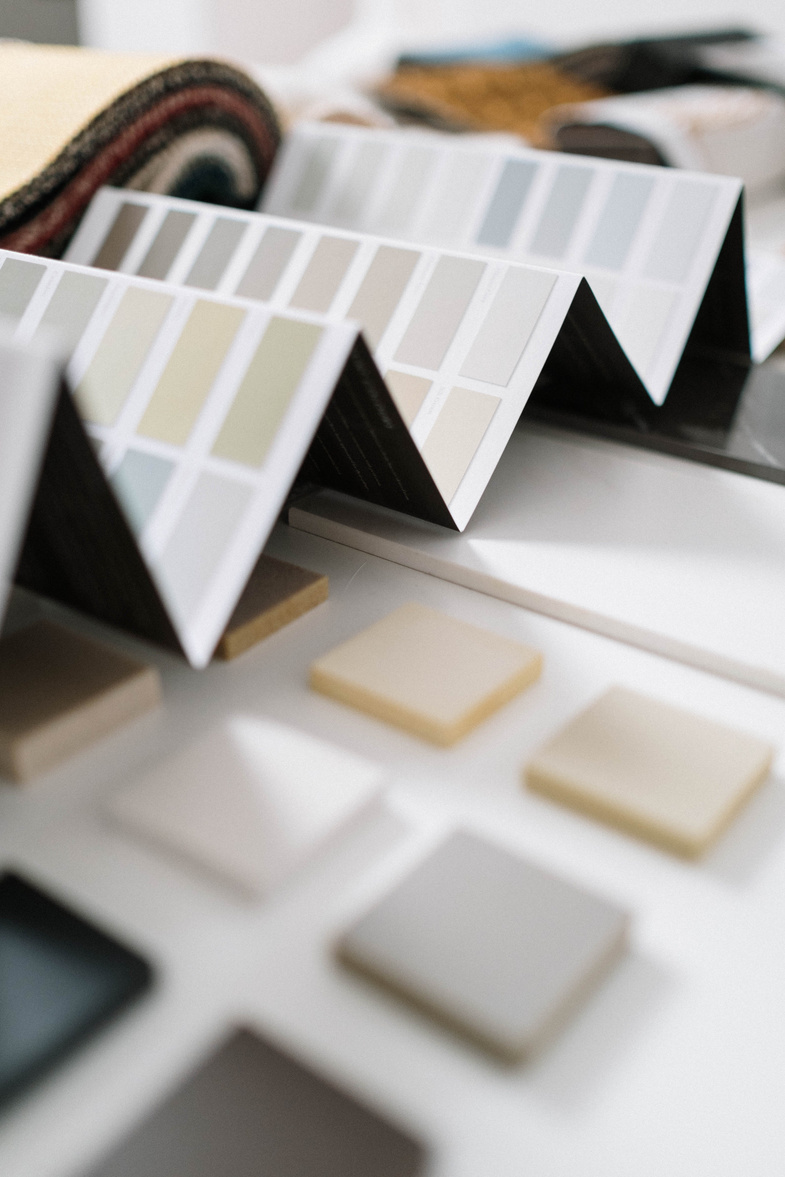
You may have heard of colours described as either warm or cool, well white is described the same way and becomes either warm or cool depending on the base colour used to mix it. White paint is mixed using either yellow (warm) or blue (cool).
For example, Dulux “Antique White USA” is considered a warm white as it has a yellow base and “Lexicon” is considered cool as it has a blue base.
Will you paint the ceiling a different colour?
If you’re erring on the cooler side of the white palette, I recommend you paint your ceiling the same colour as your walls. It’ll help to make the space feel bigger and more open.
If you’re selecting a warmer white for your walls, I recommend selecting a crisp cool white for your ceiling. This is important as warm white on all walls and the ceiling can make the room feel smaller. A crisp cool white ceiling will give the effect of raising the ceiling, and, who doesn’t want higher ceilings?
Sample Multiples
Honestly, don’t skip this step. Even if you just stick the paper colour samples on the wall make sure you do it and leave them there for at least 24 hours, this will allow you to see how the whites change over the course of the day with different light.
If you’re keen to sample, narrow it down to 3 options (3 for wall and 3 for ceiling if you need to) and buy the sample pots.
Paint a 50cm x 50cm patch on the surface you intend to paint, so don’t paint the ceiling paint on the wall as it’ll look different on the ceiling plane, paint a few coats if you need to then come back at different times during the day and observe the colour on the wall. I’m always amazed at what natural light, sunlight and artificial light do to colour, even white.
Know your lighting
Light plays a big part in colour, including white.
If your house is filled with natural light and sunlight this will act like bleach on your walls and dilute the colour. However, if your home is on the darker side this will make your white look darker than it probably did in the store.
It’s also worth considering the impact your surrounding environment will have on your wall colours. For example, my daughter’s bedroom looks out on to our neighbours red brick home. When the morning sun hits their house, it throws a reddish colour into my daughter’s room making her walls look a lot warmer/red-der than they are.
Specify your finish
Paints are available in a range of finish options. You’ll want to specify low sheen for walls and ceiling and semi-gloss for doors, door frames, window frames and trims.
A low sheen offers a hardened finish with a subtle sheen to the surface, it not only looks good but helps with durability and cleaning your walls.
The semi-gloss is hard wearing and will protect its surface from scuff marks. The semi-gloss also offers a subtle difference from the wall finish helping to frame your walls and create depth in your white colour choices.
If you’re considering the flat finish I get it, it’s a stunning matt look and catches the light beautifully, just know it’s a lot softer than the other finishes and will scuff easily. The flat finish is a good option for ceilings if you don’t trust you walls to stay scuff-free.
Picking paints can be a tricky process and if you’d prefer some help with your final selections, our colour consultation service starts at $75/hour online. If that sounds like an option for you, contact me today and we’ll get colour picking straight away.
Blog
The four factors that go into the price of every design
Design is a curious process to many, they admire it but have no idea what goes in to it, so it’s safe to say they’re a little taken aback when they receive a quote for it.
People mis-understand design as an easy process of picking colours but so much more goes in to it.
Here are four things that go in to the price of design that you may not have considered.
The time it takes
It may not seem like it when you're getting new layouts back within a week but creating design work takes a lot of time. Designers spend hours researching, marinating in ideas, sketching out options and tweaking the final pieces they'll put forward before they meet with you. Many tedious hours are spent tweaking your design concepts before they are presented back to you. If your designer is making it look easy, it’s probably because they're putting in the time behind the scenes.
The errors it stops
Some people have a real flare for the creative but for those who don’t making the wrong selections can be costly mistakes. Seeing that feature tile in your finished bathroom and realising it looks hideous can be an expensive exercise to fix. Hiring a designer from the outset is a lot more cost effective than fixing bad selections.
The qualification
Interior design is popular right now, you only have to spend a few minutes online to see how many courses there are for interior design. But here’s the thing, many of those 6-week courses are highly abridged and the graduates (see me making air quotes when I say graduates) come out with no qualifications.
I studied for five years to be an interior designer and came out with a qualification. When you pay for interior designer services, you're paying for the training and qualification that I and any other professional designer have. Years of study, experience and expertise are worth paying for.
The hidden stuff
Interior design is often perceived to only be about the 'fun stuff', but the reality is when I am working as your interior designer, I’m not only taking you on the journey of your new design, but also working within the Australian standards, BCA requirements and any legislative regulations required. When you hire me, you can expect that I have up to date knowledge not only on products, but prices, availability, quality, and any regulations associated with your project.
Design is about the hidden value, the peddling duck feet below the surface, so much goes into the design of a project that is unseen but really, that’s the beauty and ease of working with a designer.
Blog
Four tips to ensure you hire the right designer
You’ve heard the saying “you only get out as much as you put in”, it’s a simple but helpful statement and one that we comply with in many areas of life.
It’s the same when starting the process of hiring an interior designer; you only get out as much as you put in. If you approach designers with minimal information, patchy contact and a vague outline of what you want, you’ll likely get a vague response from them.
I see it all the time, people contact me wanting a quote for services, but they haven’t provided me any information about their project requirements, budget or even a brief.
It makes it very difficult to respond with meaningful information and doesn’t start the process off well. So if you’re considering contacting an interior designer for services, here are my four recommendations on how to do it well.
Write a brief
Start by writing a brief of what you want to do. Designers get excited by new projects, so even if you don’t know exactly what changes you want to make, that’s ok, say that in your brief. Designers get even more excited when they can go on that journey of discover with you.
For example, you might say something like
“I would like to renovate my home so that it is more open plan and meets the contemporary living needs of our young family. I’m looking for a designer who can help us make those changes as we’re not sure where to start”
That kind of brief will have designers knocking down your door!
Provide practical information
Things such as SQM or approximate dimensions of the area you need them to work on and any photos of the existing space, so they understand your brief better
Describe your style
Describing what you like and attaching imagery helps the designers understand what you like and will weed out any incompatible designers sooner rather than later.
Arrange a Meeting
Once you’ve received your design proposals, arrange a face-to-face meeting with each of the designers you’re considering working with (I recommend only doing this with two). It may seem like a considerable time investment, but design is a personal process, so it’s important that you like the designer you’ll be working with and feel like they understand you and your design needs.
You don’t need to have it all figured out before approaching an interior designer, but a little work up front will ensure you receive accurate design proposals and ultimately end up working with the right designer for you.
Interior design is personal process-
and it's no small thing to allow an inteior designer into that process- I get it.
So, get to know me a little first!
Here's my 30 second bio and brief overview of my experience.
a bit about me
About me
Hi There, I'm Taren!
I’m the name and face behind Maia Design.
I’ve been working as an interior designer for over 15 years and I love it. It brings me great joy to work with people on the design of their homes to create spaces that both serve their families and are a visual delight.
I live in Western Sydney with my husband and am also a mum of 2 small humans who fill my heart and drain my energy!
Working in this business allows me to grow and work in something meaningful whilst still being around for them.

I'd love to hear from you!
get in touch
If you're considering working with me, get in touch and we can arrange a no obligation video call to chat about your project.
Email
taren@maiadesign.com.au
Phone
+61 425 171 008




Let's be social!
Follow up on insta and facebook